This section provides details about the various configuration options available when defining a form input type.
Standard Configuration Options
Every input type will always have the following configuration options:
Label – this is the text that will appear adjacent to the form element
Field Key – this is the database field name (aka column name). This will usually default to converting your label; however it’s recommended to use as generic and descriptive a name as possible (so that the same field can be repurposed on other forms). For instance, name_last and name_first could be used as field keys to distinguish the First Name and Last Name input fields, but still keep them sorted together alphabetically.

Default Value – this field is available for input types that accept only one answer. It is used to establish a preselected value/answer choice. The value must match the key from the options available for questions with Key-Value pairs.
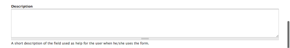
Description – this is the text that will appear just underneath the form field. Note: some fields will automatically append descriptive text like accepted file formats or file upload maximum size.
Validation > Mandatory – this checkbox is used to indicate that the form field is required.

Display options > Label – Depending on the form input type, you can hide the label from view, display it above a form input field, or inline to the left of it.

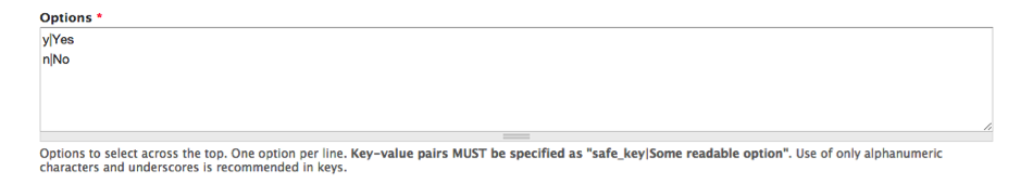
Key-Value Pair Fields – This configuration type is available for input types where a user can select from a list of predefined answers. These configuration fields will display below the input area the note:
Key-value pairs MUST be specified as "safe_key|Some readable option". Use of only alphanumeric characters and underscores is recommended in keys.
So for each answer choice, you need to list [actual value to store in database (key)] | actual value to display on the form. The example below stores “y” for Yes and “n” for No.